Is it the end of the line for the line graph?
 David Reed
The first statistical line chart dates back to 1786 when William Playfair visualised imports and exports between Demark and Norway. Even today, the line chart remains a valuable analytics tool. The heights, angles and positions of its lines can tell an array of data stories. With visual analytics, we often seek to discover what’s happening within our data over time and we also need to find insights as quickly as possible. Considering this, is a line chart really the best option to visualise time-based data?
The right chart is the one that reveals the most important insights for the audience at hand. There are many ways to visualise time, each potentially surfacing insights that would have remained hidden in a basic line chart. Trying a different chart type often reveals hidden insights, unknown unknowns, or surfaces multiple truths in a single data set.
Benjamin Franklin famously penned “lost time is never found again.” Here are the ways to cheat his assumption and expand your creative conversation with data and time.
1. The slope chart
A slope chart shows only the change between a start point and an end point, eliminating the distracting minutia between those points. Straight, angled lines may reveal answers to your questions faster, or even provoke new questions to ask.
The charts below show the top eight New York City bike stations and the number of journeys over the course of a year. The top chart shows how each station’s traffic has changed over the course of time in a regular line chart. The bottom is the same data in a slope chart.
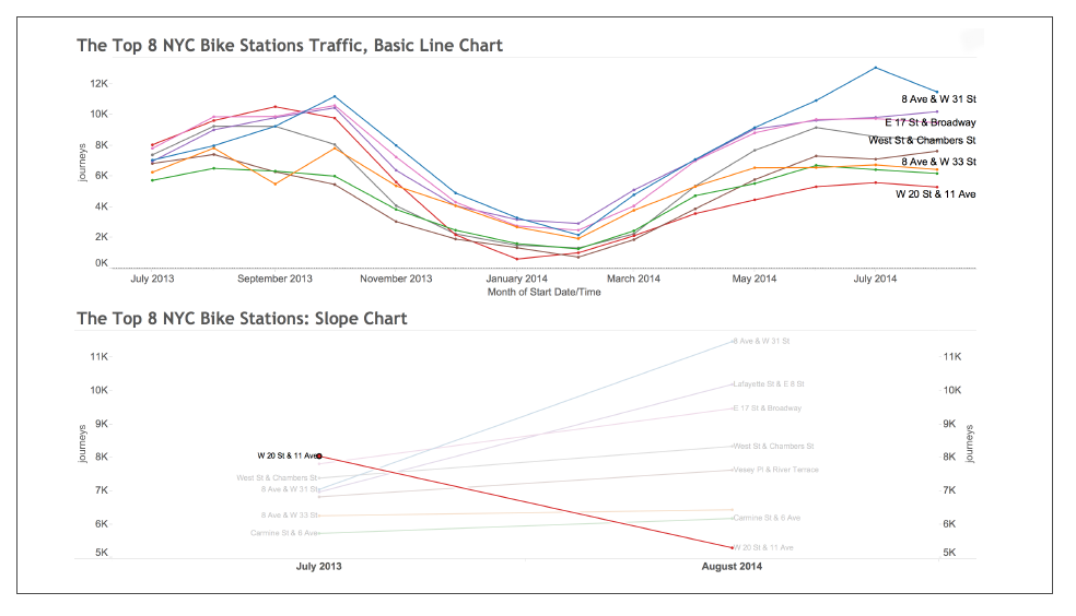
With a regular line chart, you can quickly see the seasonal lows and peaks of all of the stations, but the noise between the start and end of the data set hides the biggest insight of all: the line chart conceals the fact that the most popular station at the start was eighth most popular at the end of the period. Slope charts are useful in many instances. For example, marketers can use slope charts to visualise social media data to reveal more insights about follower growth, brand-name mentions, engagement, and reach against competitors.
2. Cycle plots
With data, we often look for seasonality and trends. But if we just have a time series that only connects start and end points, trends may remain hidden. And what if you need to compare two trends?
Cycle plots show the trends of two different time periods simultaneously. Because cycle plots show trends over the whole time period as well as shorter periods, you can present a lot of information at once.
This visualisation shows ten years of wildlife strikes on airplanes across the United States. If you were to see this on a regular line chart, you might notice that there were more strikes in 2010 than there were in 2000, but key insights remain missing. Each vertical panel is one month of the year. The line in the panel shows the number of strikes over 10 years in each month.
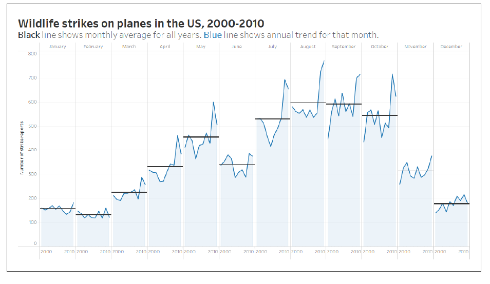
Because a cycle plot allows you to visualise several periods of time and see multiple trends at once, you can see that bird strikes are far more common in August, September and October than the other months of the year. The black line shows the monthly average and the blue line shows the annual trend for that month.
For real estate agents or sales representatives, cycle plots can quickly show important trends just under the surface of your data. Cycle plots will answer questions like: How have sales changed on each weekday over the past six months? What days of the week in each month are better for closing deals? Or what hour of the day is the highest performing? Knowing this information can drastically improve quarter planning and seasonal decision-making.
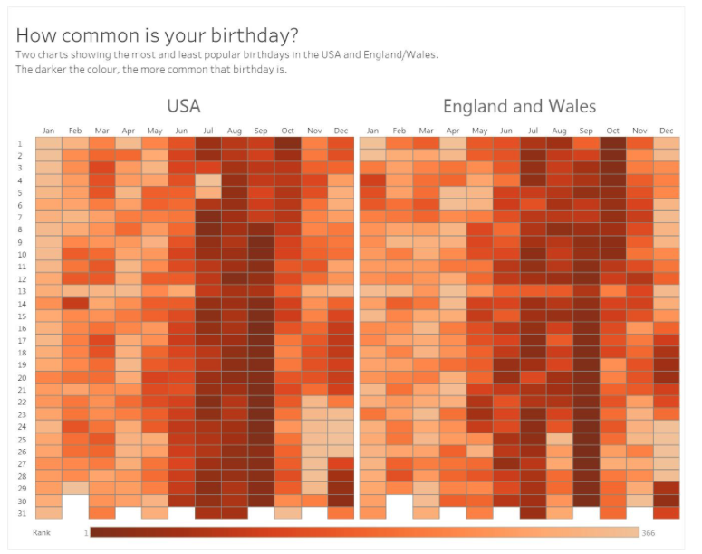
3. The highlight table
Colorful highlight tables make it easy to look at time data horizontally so you can quickly scan for patterns and hotspots. Essentially, you can look at time patterns in two different dimensions.
Using both month and year, this highlight table shows how common birth dates are in the US compared to the UK. The darker the colour, the more common the birthday. You can look at individual dates as well as trends in the colours. You can see days that have the fewest births in each country (Christmas Day in the UK, Independence Day in the US). You can also see a light horizontal row in the middle of the table: there are fewer births on the 13thof each month!
If you’re a scientist, a government worker, or even a journalist, highlight tables come in handy when you need to show impact over time in a more meaningful way.
The best chart for time-based data is one that exposes the most important information in an easy to understand way. As such, businesses should constantly explore the additional ways they can visualise time. In addition to the graphs outlined, bump charts, connected scatter plots and small multiples are all viable alternatives to the traditional line graph. Armed with so many ways, you’ll never miss an insight.
Which is the best one for you? I cannot tell you that: only you can find that out by iterating and trying different views until you hone in on the best articulation of the dataset. If Benjamin Franklin had known about all these ways to explore time, perhaps he wouldn’t have been so worried about losing it.
Did you find this content useful?
Thank you for your input
Thank you for your feedback

You may also be interested in


DataIQ is a trading name of IQ Data Group Limited
10 York Road, London, SE1 7ND
Phone: +44 020 3821 5665
Registered in England: 9900834
Copyright © IQ Data Group Limited 2024